Sunday, May 19, 2013

#9- Sprint... I am unlimited.


     This advertisement is for Sprint and for Apple. With this ad, they are selling several products with one picture. They are selling a Sprint's service through the form of an iPhone 5, which seems like a good idea, but is it, actually?

     The background color for this ad is yellow. It not only stands out and catches your eye, but it is also their brand color. Then in the center of the picture is an iPhone 5. It is very large compared to everything else in the ad. It is standard, but very shiny (it looks brand new and probably is). It even has the original apps on the front page, without any additions. It shows the front side of the phone, and the back side of the phone is just behind it. It gives the effect of an invisible mirror. This picture gives off the impression that switching to Sprint will automatically mean that you will own a shiny, new iPhone 5.

     In the bottle center of the page, directly beneath the iPhone 5, is the Apple logo next to the words iPhone 5. In the top right-hand corner of the page is the Sprint logo. It seems that Apple has gotten more publicity from this ad than Sprint. Their picture is front and center and their logo is larger. Sprint still gets a lot of publicity. However, it is less obvious. Theirs is found in the background color and the words on the page.

     The words start out as if the viewer is having a conversation with the iPhone. It says "I don't look up answers. I get an education." Frankly, this does not make one bit of sense to me. I don't understand if the phone is supposed to be educated or if they are saying that the viewer is. Either way, it don't really care if my phone looks up answers for me. That's kind of what I want it to do. Underneath that, in the biggest letters on the page, " I am unlimited." Actually, this seems like a good advertising technique. Something that is unlimited seems desirable. Further down, in much smaller print, the ad says "only Sprint offers Truly Unlimited date for your IPhone 5." It then talks about all of the stuff you can get unlimited "with no metering, no throttling, and no overages ?" No overages? Isn't that kind of what unlimited means, not being able to go over? Also, what is metering or throttling? I have no idea! However, they say that there isn't any, which makes it seem like a good thing. They would brag about not having something if it wasn't bad.

     Overall, I think that this ad was an effective combination of Sprint and Apple. It promoted both companies very well. It caught the attention of the reader without being too overwhelming. Also, the font sizes encouraged the viewer to read the important or impressive parts, without having to read the smaller print that is less interesting.

Sunday, May 12, 2013

#8- Taylor Swift, walk on (in your Keds)


Honestly, I love Taylor Swift. Anyone that I’ve ever talked to would tell you that I love Taylor Swift. But, don’t worry, this post isn’t going to be about how amazing I think she is, it’s going to be about her ad. She is now in alliance with Keds, the shoe company. This ad Is interesting, to say the very least

I love Taylor Swift. But, I don’t love her ad. Something about it seems very staged. Yes, I understand that there are photo shoots and that pictures in advertisements don’t just come out in real time. However, it’s just so unrealistic. For most sneaker advertisements, I like seeing ads where people are running around and having a good time! People don’t buy sneakers so that they can have the fanciest shoes on the block! They want a nice looking shoe that is comfortable and inexpensive. Having a scene that looks so staged and fake doesn’t do a sneaker advertisement justice.

Next, let’s look at the color scheme in this advertisement. Or lack thereof. There is honestly no pattern to the colors in this. That is not a bad thing, except for the fact that they are not selling the shoe, they are selling Taylor Swift. They have her in a yellow sweater and white pants that contrast with the background, making her stand out. However, the shoes are orange and the seats are red. You can barely see them! They are not central in the picture, or even near it. They are resting in a bottom corner, just hoping to go unnoticed. Not the best place for the thing you’re trying to sell, Keds.

The words on the page read “Go Ahead, Get Your Hopes Up.” I assume they mean that if they wear Keds sneakers that they will become and talented and wonderful as Taylor Swift. If that were true, I would buy and pair and never take them off. However, it’s just not realistic. Still, I like the message that it’s sending. It’s saying “Hey, hope for the best and work your hardest! Maybe it will turn out great for you, just like it did for Taylor Swift!” Yeah! Maybe, I can get a contract with Keds, too. I mean, I wouldn’t argue.

Now, while I love Taylor Swift, I just didn’t like this advertisement. Keds are fine shoes, but the ad just didn’t do anything for me. It seemed… boring. And really normal for an ad. If it hadn’t had Taylor Swift, I wouldn’t have looked at it at all. Then again, maybe that’s what Keds wants? They want me to aspire to be like Taylor Swift and are trying to get me to buy their product by association. Still, I just don’t think I’m going to go buy some Keds because of this ad. Sorry, Taylor.

#7- Olay Fresh Effects... 400% Better?


This advertisement immediately catches the viewer’s eye. All of the colors are bright and fun. Everything about this advertisement screams happiness energy. Let’s start” in black. It is in their normal logo format, which is fine. Right underneath it are the words “fresh effects.” This is the name of the specific product. The interesting thing about it though, is that it is in green lettering and very curly, jumpy, cursive. I think that this is very good on the advertiser’s part. This format will be sure to not only make me notice it, but also make me remember it. It is interesting, and it is different.

Next, you move down to the actual product. It is being used by a young woman, who is smiling (of course), and it has animated swirls and bubbles coming off of it. This gives it an unreal sort of feeling. This could be interpreted as either good or bad. On the one hand, you could see it as a dream product that will work magic. On the other hand, you could interpret it as fake. However, I think it’s safe to assume that most people will interpret it as the first.

Moving down even further, you start to see the words. What you first see is “New {Va-va-Vivid!} Vibrating cleansing brush!” By just reading the words, you can sense the energy coming out of the ad. The colors, font, and punctuation all put emphasis on this exciting new product. Underneath that are words highlighted in white. They read” Sparkling fresh skin for a vava voom clean.” Now, I’m not exactly sure what they mean by “vava voom.” I would understand it more if it was the name of the product, but it isn’t. However, who doesn’t want sparkling fresh skin?

The only part of this advertisement that really bothers me is the line underneath all of the other text. It says “{that’s 400% better}.” First of all, what does that even mean? Do they mean it as a statement, like a continuation of the line before? “… for a vava voom clean that 400% better.” Or, do they mean for it to be separate? “That’s 400% better (insert other brand or product that it is 400% better than).” They need to clarify that! Also, how can something be 400% better than something else? That statistic seems a little bit off to me… right? If it really is 400% better, then what is going so crazily wrong with everyone else’s product or their previous products?

Despite that statistic, I thought that the ad was very effective. The advertisers did a very good job at creating an ad that catches the eye and holds it, and convincing the viewer that their ad is upbeat and “hip.” This convinces the viewer to buy the product because they believe that the product will make them energetic and fun.

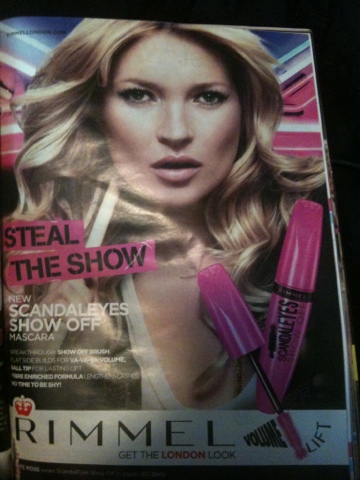
#6- Rimmel ScandalEyes


“Look at me!!!”

That’s the only thing playing through my head while I look at this advertisement. That’s what they want though, right? This ad plays on a teenage girl’s desire to be admired and looked at, otherwise known as the “need for attention.” This technique works for the advertisement.

            The first thing you see in this ad is Kate Moss, a famous model. She has blonde hair with nice curls and her make-up is done perfectly. Your eyes are then immediately drawn to the color pink. Pink is the color of the mascara tube and the words on the left. They catch your eye and hold it until you feel like you’ve seen everything. At the bottom of the ad is a white strip that says the brand name and slogan. This really catches the viewer’s eye because it contrasts with the dark colors surrounding it.

            Now, let’s look at the words on the left of the advertisement. I don’t think that they are very effective for the advertisement. First of all, there is a lot of them. No one wants to read a whole bunch of information in an advertisement- it just won’t hold their attention for that long. Secondly, they are all in one space. If they were more spread out among the ad, there would be a greater chance of getting read, but they aren’t. Lastly, they are very small. There is some emphasis on small phrases, such as “Steal the Shadow” and “Scandal eyes Show off Mascara.” Other than that, the text is mostly ignored.

            Overall, I think that this advertisement isn’t very effective. Your attention is drawn to the mascara tube and the words “steal the show,” but the advertisement doesn’t convince you to buy the product at all. 

Sunday, May 5, 2013

#5- Eco-Friendly Hair? Only if it shines!


As I sat, patiently waiting to get my hair cut, I decided to flip through a magazine. This is an ad I found. As I looked closer, I thought “who wouldn’t want hair like that? I surely do.”

Everything about this ad stands out. The first thing that caught my attention was all of the bright colors. The first think you see is a bright green color that’s contrasts with the sky blue background and the bright blonde hair that the model has. It really grabs your eye. Next, you notice the words. On the top right, it says “Pure health weightless shine.” That sounds pretty good to me! Only, I’m not exactly sure what they mean. However, that doesn’t matter very much once the notice the model’s hair. It looks incredible! It’s voluminous, shiny, and not a single hair is out of place. Once you see how awesome, her hair is, it doesn’t matter if all of the words aren’t understood. If my hair looked like that, I wouldn’t care at all!

The next thing that caught my eye was the little splash of red at the bottom. It stands out because it’s the only red thing in the entire picture. I assume the red is there to draw your attention to the words that are right next door (It worked!). It says “Pure Clean.” While I still don’t know what that means, I kept on reading.

It states that it has 92% Biodegradable Formulas with Acerola berry antioxidant, no heavy silicones, and no dulling residues. Let’s start with the 92% Biodegradable formula. That sounds really good! While it isn’t 100%, it’s still better than a whole lot of other shampoos. Plus, when I use it, I can feel eco-friendly! Next is the Acerola berry antioxidant. I have no idea what that is. Not one clue. However, it sounds natural, and natural is good, right? Then, we move on to no heavy silicones. I also don’t know what that means. Isn’t silicon the stuff they use for plastic surgery? Also, what’s the difference between a heavy silicone and a normal silicone? Is there a light silicone? Don’t ask me! Then there’s no dulling residue. Of course there’s no dulling residue! Would her hair be that shiny if there was?

Lastly, I saw the globe towards the bottom of the page. Underneath the globe, it reads “The strength to shine.” Umm… okay? Thanks, Garnier! I don’t see how this fits in with the rest of the advertisement. Yes, the model’s hair is very shiny after using Garnier Fructis Pure Clean shampoo. However, that isn’t really strength, is it? It’s more… shopping choices? So I don’t really see how that works.

Overall, I thought that this ad was very effective. It not only caught the viewers attention, but also drew them in far enough to keep reading. I probably won’t buy this shampoo, but not for lack of reason. I just tend to stick to the cheap brand. However, if I were very concerned about the shininess of my hair, I would definitely look into buying this shampoo.

(5-5-13)

#4- More is Better.... Are you sure?


AT&T has recently discovered something brilliant. Something that will go down in history as the most famous discovery of all time… or, the most incorrect one. Their new advertisements have been campaigning that “More is Better.” Now, I’m pretty sure that’s not true. Okay, let’s face it, it’s completely not true! There are so many situations in which more is definitely NOT better. What are you thinking about AT&T?!

Now let’s get to this advertisement. At the top, in gray, are the words “What’s more?” Underneath them, there are two check boxes, “More” and “Less.” Of course, the box labeled “more” is checked. I don’t exactly understand that part. It seems to me as if they’re asking which box is labeled “more.” Maybe they are! Who knows? Certainly, not me.

In the middle of the picture is a map of the United States behind the words “AT&T. the nation’s largest 4G network.” I honestly could not tell you if that’s true or not. I don’t even know what 4G means! All I know is that “4G” is in orange instead of blue, so that it stands out, and it has a little flame coming off of it. This is meant to draw your attention, and it works. However, I’m not clear about what it’s drawing my attention to. While I don’t know what 4G actually means, I've heard it used before. Whenever people say it, it sounds really good. Almost as if it’s something to be admired or looked at.

In the bottom center of the page, the advertisement says “It’s not complicated. More is better.” That statement actually offends me.  First of all, never say “It’s not complicated” in an advertisement. It is complicated! Besides, even if it wasn't complicated, maybe I didn't understand. Saying that makes them sound very belittling and derogatory, which I’m not okay with. Whenever I read those words, I think of a really smart person making fun of another person for not being as smart. Anyways, not cool! Secondly, more isn't always better. So, shame on you AT&T! You made your reader feel stupid when you were the one who was wrong.

Another thing that is “wrong” about their advertisement is their use of colors. Nearly the entire page is gray! It doesn't draw the reader’s attention to the picture at all. It is mostly gray with some words in blue and orange. However, those words don’t take up enough of the page to make it stand out. It’s really sad looking. I saw it only because I was looking for advertisements. If I had just been flipping through a magazine, it wouldn't have stood out at all! Cheer up, AT&T! Bring some color into your advertisements!

There are also weasel words used in this advertisement. The most obvious ones are “More” and “Better.” What does AT&T even mean? What do they have more of? Why does having more of whatever they have make it better? Even if I weren’t trying to analyze this ad, I would be so annoyed at AT&T for not being specific. Tell me information about what you have! I would understand if it were some other product, maybe one that is impossible to give information about on paper. But AT&T is not one of those products! They can tell the viewer SOME kind of information, right? Instead of just “More is Better.” Yeah, okay, thanks AT&T. More is Better. Good to know, I’ll put that into by bank of knowledge. Now, tell me something about YOUR product that have more than another brand. And tell me why that much more makes it so much better!

Overall, I really disliked this ad. I thought that it was worthless in catching the viewers attention and in convincing the reader to use them as a carrier. I guess this ad just doesn't do it for me.

(5-5-13)

#3- Aww, Budweiser... that's just too sweet!


Every time I see this commercial, my eyes start to tear up. Now, I know I’m not supposed to cry at a Budweiser beer commercial, but how can you not? You get to see the life of a baby foal and the emotional connection he has with his trainer! While none of that is true, and the trainer is most likely just another actor, it’s touching. On top of that, you have the song “Landslide”, performed by Fleetwood Mac, going in the background. The lyrics to that song, even without the video, are enough to make some people cry.


Well, I've been afraid of changing 
'Cause I, I built my life around you 
But time makes you bolder 
Children get older 
I'm getting older too 

So, take my love, take it down 
Oh climb a mountain and turn around 
If you see my reflection in the snow covered hills 
Well the landslide will bring you down”


Touching, right? Budweiser was very smart in creating this commercial. It reminds me of the SPCA commercials. You know, with the sad-looking animals and the dramatic music playing? This appeals to people’s need to nurture. Watching the small foal growing up really touches your maternal instincts and makes to feel an emotional connection to it and its trainer.

            This commercial also uses the advertising technique of patriotism. This is the suggestion that using this product will show a love of one’s country. In the commercial, the setting is on a ranch in what seems to be the lower Midwest or the South. The trainer is a man wearing boots, jeans, and a baseball cap. He is used to represent a modern-day cowboy. He looks trustworthy, caring, and very hardworking. These are traits that people in America want to be associated with, as well. By their choice of setting and actors, Budweiser has created a scene that appears to be a stereotypical ranch in the United States. By using this to sell their product, they are associating Budweiser beer with what American people want themselves and their country to be like. They begin to believe that Budweiser is how you achieve that.

            I think that this commercial was very effective for Budweiser. Not only did they achieve an emotional connection with the viewer, but they also got the viewer to remember the commercial for a long time. The first time I saw this commercial was during the Super Bowl, and every time I see a Budweiser product, I immediately think of the commercial. Any commercial that can do that, is doing something right.

(5-5-13)